Show the code
```{r}
library(pegas)
library(phyclust)
library(gap)
```Module: Plant Genetic Resources (3502-470)
For this computer lab the following R packages are required:
pegasphyclustgapMake sure that they are installed and loaded
```{r}
library(pegas)
library(phyclust)
library(gap)
```We continue to use our data set with teosinte individuals, maize landraces and maize improved varieties.
Download the data from the website:
First, load the data set and sample lists that you saved as an Rdata objects in the first computer lab:
```{r}
load("data/zea_snps.RData")
load("data/teosinte_acc.Rdata")
load("data/landraces_acc.Rdata")
load("data/varieties_acc.Rdata")
```The goal of this computer lab is to conduct a test of neutral evolution with our real data set, i.e. we want to know if this 3 Mb region on chromosome 1 evolves neutrally or whether it is influenced by either demographic events or selection.
Next to the estimators of the mutation parameter \(\theta=4N_e\mu\), the Watterson’s \(\theta_W\) and the nucleotide diversity \(\Pi\), we will also calculate the neutrality test statistic Tajima’s \(D\). The latter will allow us to detect departures from a coalescent model with neutral mutation.
We will calculate first Tajima’s \(D\) for our sample sets:
```{r}
pegas::tajima.test(zea_snps[teosinte_acc,])
tajima.test(zea_snps[landraces_acc,])
tajima.test(zea_snps[varieties_acc,])
```
Write the values into a table like this one:
| data set | Tajima’s \(D\) | P-value |
|---|---|---|
| teosinte | -0.8907504 | 0.3730631 |
| landraces | -0.7142114 | 0.4750964 |
| improved varieties | 0.3525113 | 0.7244548 |
We will now simulate data sets with the parameters from our true data sample sets (sample size, \(\theta_W\)), calculate \(\theta_W\), \(\pi\) and Tajima’s \(D\) for all simulated data sets and then plot the distributions and compare those to the observed values. This is analogous to what we did in the last computer lab.
(Note that although we do only 300 simulations, run times of some of the commands can still be a few minutes.)
If Rstudio crashes with 300 simulations, reduce the number of simulations to 200 or even 100 or 50… by setting the variable sim_countbelow. If it keeps crashing, move on to the next part on page 4, in which we do the same for a specific region within out data set.
First we simulate the data sets with ms:
```{r}
sim_count <- 50 # number of simulations to run

# teosinte
sim_teosinte <- ms(length(teosinte_acc), sim_count, paste("-t", theta.s(zea_snps[teosinte_acc,])))
seq_teosinte <- read.ms.output(sim_teosinte,is.file = FALSE)
gametes_teosinte <- seq_teosinte$gametes

# landraces
sim_landraces <- ms(length(landraces_acc), sim_count, paste("-t",theta.s(zea_snps[landraces_acc,])))
seq_landraces <- read.ms.output(sim_landraces,is.file = FALSE)
gametes_landraces <- seq_landraces$gametes

# varieties
sim_varieties <- ms(length(varieties_acc), sim_count, paste("-t",theta.s(zea_snps[varieties_acc,])))
seq_varieties <- read.ms.output(sim_varieties, is.file = FALSE)
gametes_varieties <- seq_varieties$gametes
```
And then we recode the output into a DNAbin objects:
```{r}
f.recode <- function(m){ # Function to recode sequence as mock DNA sequence
  m[m==0] <- "a"
  m[m==1] <- "c"
  as.DNAbin(t(m))
}

# teosinte
gametesseq_teosinte <- lapply(gametes_teosinte, f.recode)
# landraces
gametesseq_landraces <- lapply(gametes_landraces, f.recode)
# varieties
gametesseq_varieties <- lapply(gametes_varieties, f.recode)
```
We can now plot the distribution of \(\theta_W\) values; the red lines will show the mean of the distributions, the blue lines the observed values:
```{r}
library(ggplot2)

# 1. Gather your theta estimates into one data frame
df <- data.frame(
  theta = c(
    sapply(gametesseq_teosinte, theta.s),
    sapply(gametesseq_landraces, theta.s),
    sapply(gametesseq_varieties, theta.s)
  ),
  group = factor(rep(
    c("teosinte", "landraces", "varieties"),
    times = c(
      length(gametesseq_teosinte),
      length(gametesseq_landraces),
      length(gametesseq_varieties)
    )
  ), levels = c("teosinte", "landraces", "varieties"))
)

# 2. Compute the two reference lines per group
summary_df <- data.frame(
  group = factor(c("teosinte", "landraces", "varieties"),
                 levels = c("teosinte", "landraces", "varieties")),
  mean_theta = c(
    mean(sapply(gametesseq_teosinte, theta.s)),
    mean(sapply(gametesseq_landraces, theta.s)),
    mean(sapply(gametesseq_varieties, theta.s))
  ),
  theta_pop = c(
    theta.s(zea_snps[teosinte_acc,]),
    theta.s(zea_snps[landraces_acc,]),
    theta.s(zea_snps[varieties_acc,])
  )
)

# 3. Plot with facets
ggplot(df, aes(x = theta)) +
  geom_histogram(bins = 20, fill = "grey80", color = "black") +
  geom_vline(
    data = summary_df,
    aes(xintercept = mean_theta),
    color = "red", size = 1
  ) +
  geom_vline(
    data = summary_df,
    aes(xintercept = theta_pop),
    color = "blue", linetype = "dashed", size = 1
  ) +
  facet_wrap(~ group, ncol = 1, scales = "free_y") +
  labs(
    x = expression(theta),
    y = "Count"
  ) +
  theme_minimal(base_size = 14) +
  theme(
    strip.text = element_text(face = "bold"),
    panel.spacing = unit(1, "lines")
  )
```
These are the plots for the \(\pi\) values:
```{r}
library(ggplot2)

# 1. Define your per-locus $\pi$ function
locus_nuc_div <- function(x) {
  nuc.div(x) * ncol(x)
}

# 2. Build a single data frame of all $\pi$-values
df_pi <- data.frame(
  pi = c(
    sapply(gametesseq_teosinte,    locus_nuc_div),
    sapply(gametesseq_landraces,   locus_nuc_div),
    sapply(gametesseq_varieties,   locus_nuc_div)
  ),
  group = factor(rep(
    c("teosinte", "landraces", "varieties"),
    times = c(
      length(gametesseq_teosinte),
      length(gametesseq_landraces),
      length(gametesseq_varieties)
    )
  ), levels = c("teosinte", "landraces", "varieties"))
)

# 3. Compute the two vertical‐line positions per group
summary_pi <- data.frame(
  group   = factor(c("teosinte", "landraces", "varieties"),
                   levels = c("teosinte", "landraces", "varieties")),
  mean_pi = c(
    mean(sapply(gametesseq_teosinte,  locus_nuc_div)),
    mean(sapply(gametesseq_landraces, locus_nuc_div)),
    mean(sapply(gametesseq_varieties, locus_nuc_div))
  ),
  theta_ref = c(
    theta.s(zea_snps[teosinte_acc,]),
    theta.s(zea_snps[landraces_acc,]),
    theta.s(zea_snps[varieties_acc,])
  )
)

# 4. Plot
ggplot(df_pi, aes(x = pi)) +
  geom_histogram(bins = 20, fill = "grey80", color = "black") +
  # red line = sample mean $\pi$
  geom_vline(data = summary_pi,
             aes(xintercept = mean_pi),
             color = "red", size = 1) +
  # blue dashed = reference $\hat{\theta}$
  geom_vline(data = summary_pi,
             aes(xintercept = theta_ref),
             color = "blue", linetype = "dashed", size = 1) +
  facet_wrap(~ group, ncol = 1, scales = "free_y") +
  labs(
    x = expression(pi),
    y = "Count"
  ) +
  theme_minimal(base_size = 14) +
  theme(
    strip.text = element_text(face = "bold"),
    panel.spacing = unit(1, "lines")
  )
```
And for the Tajima’s \(D\) values:
```{r}
library(ggplot2)

# 1. Define your Tajima’s D extractor
tajD <- function(v) {
  tajima.test(v)$D
}

# 2. Build a single data frame of all D-values
df_D <- data.frame(
  D = c(
    sapply(gametesseq_teosinte, tajD),
    sapply(gametesseq_landraces,  tajD),
    sapply(gametesseq_varieties,  tajD)
  ),
  group = factor(rep(
    c("teosinte", "landraces", "varieties"),
    times = c(
      length(gametesseq_teosinte),
      length(gametesseq_landraces),
      length(gametesseq_varieties)
    )
  ), levels = c("teosinte", "landraces", "varieties"))
)

# 3. Compute per-group reference lines
summary_D <- data.frame(
  group    = factor(c("teosinte", "landraces", "varieties"),
                    levels = c("teosinte", "landraces", "varieties")),
  mean_D   = c(
    mean(sapply(gametesseq_teosinte, tajD)),
    mean(sapply(gametesseq_landraces,  tajD)),
    mean(sapply(gametesseq_varieties,  tajD))
  ),
  D_ref    = c(
    tajD(zea_snps[teosinte_acc,]),
    tajD(zea_snps[landraces_acc,]),
    tajD(zea_snps[varieties_acc,])
  )
)

# 4. Plot with facets
ggplot(df_D, aes(x = D)) +
  geom_histogram(bins = 20, fill = "grey80", color = "black") +
  # red: group mean
  geom_vline(data = summary_D,
             aes(xintercept = mean_D),
             color = "red", size = 1) +
  # blue dashed: reference Tajima's D
  geom_vline(data = summary_D,
             aes(xintercept = D_ref),
             color = "blue", linetype = "dashed", size = 1) +
  facet_wrap(~ group, ncol = 1, scales = "free_y") +
  labs(
    x = "Tajima’s D",
    y = "Count"
  ) +
  theme_minimal(base_size = 14) +
  theme(
    strip.text = element_text(face = "bold"),
    panel.spacing = unit(1, "lines")
  )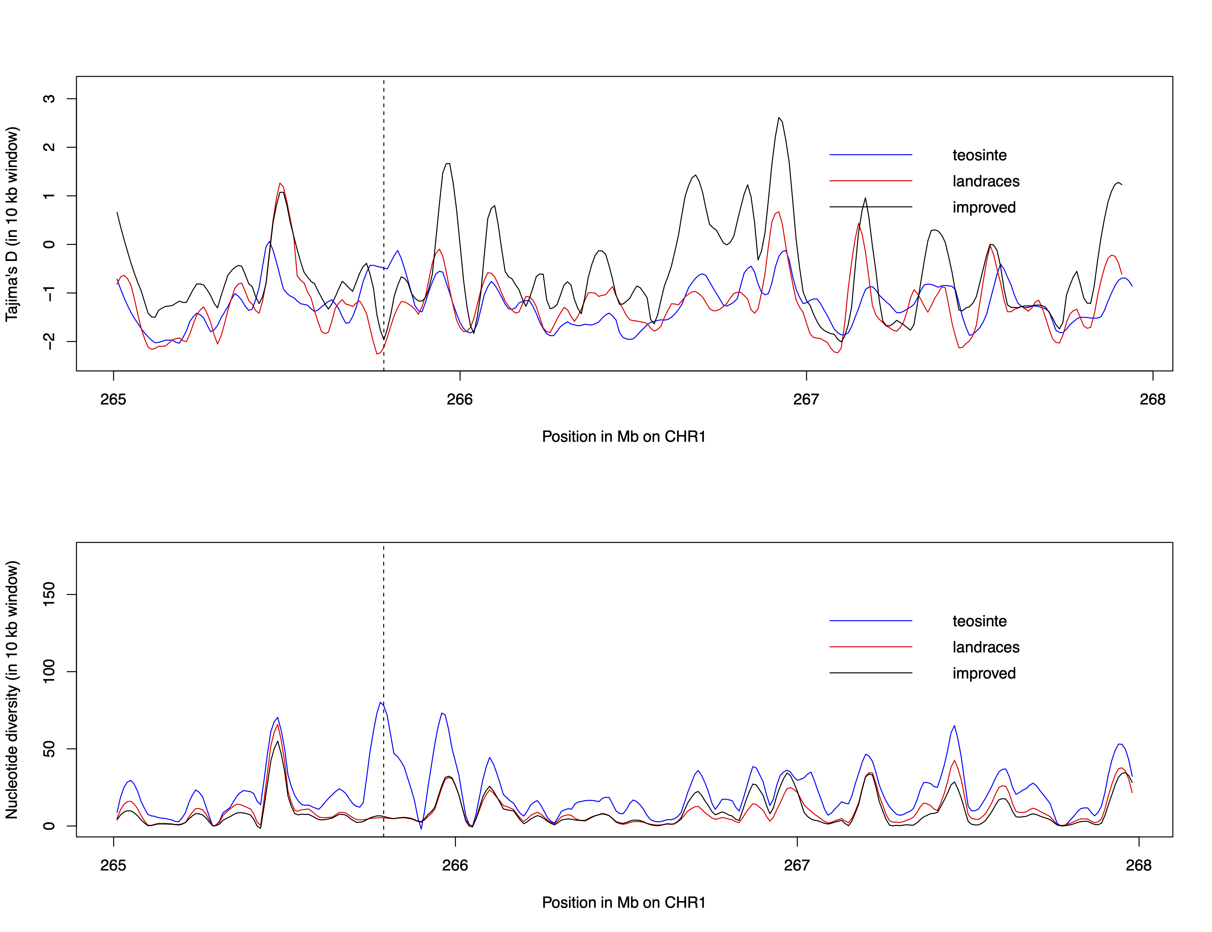
```So far, we have only looked at the entire 3Mb region on chromosome 1. Sliding windows calculated with the R package PopGenome for nucleotide diversity, \(\pi\), and Tajima’s \(D\) show fluctuations along this region (see figure). We will now closer investigate a small region which shows a reduced genetic diversity and a lower Tajima’s \(D\) in the landraces and the varieties but not in teosinte. The dashed line in the figure marks this region.
For this we will first extract the respective region from our DNAbin object:
```{r}
zea_region <- zea_snps[,10735:11426] # extracts the SNPs from the DNAbin object
```
We can calculate Tajima’S \(D\) for this region:
```{r}
tajima.test(zea_region[teosinte_acc,])
tajima.test(zea_region[landraces_acc,])
tajima.test(zea_region[varieties_acc,])
```
Write the values into a table like this one:
| data set | Tajima’s \(D\) | p-value |
|---|---|---|
| teosinte | 0.5925368 | 0.5534912 |
| landraces | -2.335788 | 0.01950229 |
| improved varieties | -2.329903 | 0.0198113 |
What conclusions can you draw for this region for the three sample sets?
And then we will repeat the simulations from before:
```{r}
## simulations
sim_count <- 50 # number of simulations to run

# teosinte
sim_teosinte <- ms(length(teosinte_acc), sim_count, paste("-t",theta.s(zea_region[teosinte_acc,])))
seq_teosinte <- read.ms.output(sim_teosinte, is.file = FALSE)
gametes_teosinte <- seq_teosinte$gametes

# landraces
sim_landraces <- ms(length(landraces_acc), sim_count, paste("-t",theta.s(zea_region[landraces_acc,])))
seq_landraces <- read.ms.output(sim_landraces, is.file = FALSE)
gametes_landraces <- seq_landraces$gametes

# varieties
sim_varieties <- ms(length(varieties_acc),sim_count, paste("-t",theta.s(zea_region[varieties_acc,])))
seq_varieties <- read.ms.output(sim_varieties, is.file = FALSE)
gametes_varieties <- seq_varieties$gametes

## recoding in DNAbin objects

f.recode <- function(m){ # Function to recode sequence as mock DNA sequence
  m[m==0] <- "a"
  m[m==1] <- "c"
  as.DNAbin(t(m))
}

# teosinte
gametesseq_teosinte <- lapply(gametes_teosinte, f.recode)
# landraces
gametesseq_landraces <- lapply(gametes_landraces, f.recode)
# varieties
gametesseq_varieties <- lapply(gametes_varieties, f.recode)
```
We plot the distribution of Tajima’s \(D\) values; again the red lines will show the mean of the distributions and the blue lines the observed values:
```{r}
library(ggplot2)

# 1. Tajima’s D extractor
tajD <- function(v) {
  tajima.test(v)$D
}

# 2. Stack all D-values into one data frame
df_D <- data.frame(
  D = c(
    sapply(gametesseq_teosinte, tajD),
    sapply(gametesseq_landraces,  tajD),
    sapply(gametesseq_varieties,  tajD)
  ),
  group = factor(rep(
    c("teosinte", "landraces", "varieties"),
    times = c(
      length(gametesseq_teosinte),
      length(gametesseq_landraces),
      length(gametesseq_varieties)
    )
  ), levels = c("teosinte", "landraces", "varieties"))
)

# 3. Compute per‐group means and reference D from zea_region
summary_D <- data.frame(
  group    = factor(c("teosinte", "landraces", "varieties"),
                    levels = c("teosinte", "landraces", "varieties")),
  mean_D   = c(
    mean(sapply(gametesseq_teosinte, tajD)),
    mean(sapply(gametesseq_landraces,  tajD)),
    mean(sapply(gametesseq_varieties,  tajD))
  ),
  D_ref    = c(
    tajD(zea_region[teosinte_acc,]),
    tajD(zea_region[landraces_acc,]),
    tajD(zea_region[varieties_acc,])
  )
)

# 4. Plot with vertical facets and reference lines
ggplot(df_D, aes(x = D)) +
  geom_histogram(bins = 20, fill = "grey80", color = "black") +
  # red = mean of sample
  geom_vline(data = summary_D,
             aes(xintercept = mean_D),
             color = "red", size = 1) +
  # blue dashed = tajD from zea_region
  geom_vline(data = summary_D,
             aes(xintercept = D_ref),
             color = "blue", linetype = "dashed", size = 1) +
  facet_wrap(~ group, ncol = 1, scales = "free_y") +
  labs(
    x = "Tajima’s D",
    y = "Count"
  ) +
  theme_minimal(base_size = 14) +
  theme(
    strip.text   = element_text(face = "bold"),
    panel.spacing = unit(1, "lines")
  )
```The concept of this computer lab has been used in the following two publications: