Show the code
```{R}
a <- rnorm(1000,0)
shapiro.test(a)
```A picture is worth 10,000 words – Anonymous
This proverb explains the utility of visualization: Complex data or results can be simplified by visualization to enhance understanding and insight. For this reason, it is a means to summarize information. Visualization can also lead to new insights by presenting data in a different way, therefore it is also a means for inference and exploration to discover new (and possibly unexpected) patterns in the data, explanations of the data and may lead to new scientific hypotheses.
The goal of this chapter is not to provide a list of tips for a good visualization of scientific data, but to provide an introduction into visual thinking In this approach, we closely follow the concepts of the information scientist and graphics designer Edward Tufte^.[His website is at http://www.edwardtufte.com.]
The value of visualization is demonstrated by some simple data in Table 1 and their visualization in Figure 1.
| \(x\) | \(y\) |
|---|---|
| 1 | 3.5 |
| 2 | 11.8 |
| 3 | 23.9 |
| 4 | 39.6 |
| 5 | 58.5 |
| 6 | 80.5 |
| 7 | 105.4 |
| 8 | 133.0 |
| 9 | 163.7 |
| 10 | 196.8 |
| 20 | 662.0 |
| 30 | 1,345.9 |
| 40 | 2,226.8 |
| 50 | 3,290.5 |
| 60 | 4,527.2 |
| 70 | 5,929.1 |
| 80 | 7,489.9 |
| 90 | 9,204.3 |
The visualization of the data shows that there is a linear relationship between the values, but only after a log-log-transformation. This indicates that the data in the table were generated from a mathematical function of the form
\[ f(x) = k \cdot x^a \tag{1}\]
where \(k\) is a constant and \(m\) is the slope in the log-log plot.
Visualization extends very much beyond the plotting of scientific diagrams. It merges with computer graphics, photography, animations and so on. As a consequence of the data explosion in and outside of science a whole new field of information graphics evolved that is concerned with the optimal (and truthful) representation of information. Nevertheless, visualization has been an important tool since the beginning of era of the New World (beginning with the discovery of the Americas by Columbus), and in particular since the industrial revolution. Even in artistic paintings, useful information was stored and visualized to improve understanding.
One of the first visualizations that contains a large number of data points by Charles Joseph Minard (1781-1870; Wikipedia), a French Civil Engineer (Figure 2). This classical graphics shows the changes in Napoleon’#s army during and after the march to Moscow (Figure 2). It is a band graph for illustration of flows that are also called Sankey diagrams (Wikipedia).
Minard’s figure integrates various types of data:
In Figure 2 multidimensional data are reduced on to two dimensions, without much loss of information. One important aspect of a good information graphic is that it contains raw data that allow to check whether their representation as graphical elements is correct. One way to measure the effectiveness of a graphic is to express it as its information content. How many data points are included in the graph? The information content of a graph is useful decide whether it is better to present data as a table or as a figure. As a rule of thumb, the leading information scientist and graphics designer Edward Tufte postulated that a data set with less than 20 data points should be presented as a table.
Another approach to how both temporal and spatial information can be visualized is shown in Figure 3. Again, four dimensions are represented in two dimensions.
One of the important decisions in the context of visualization is whether to present results as table or figure. This can be demonstrated with the following example. A simple way to express the information content can be shown with a normal distribution. With the statistics package R, one can easily simulate 1,000 normally distributed data points with a mean of 0 (Listing 1).
a <- rnorm(1000,0) a [1] -0.0210952179 -1.0912065990 -1.1395054396 -1.3189259016 … [8] -0.2912739666 -0.1470279242 1.7375103224 1.2480682763 … … [988] 0.0045077573 -0.1658796133 -0.2793556344 -0.1170640982 … [995] 2.0871831247 -0.4179269672 -0.4178945557 -0.3895868971 …
Obviously, the raw data are not suitable for visualization. If we want to summarize and simplify the data, there are several possibilities. We can calculate the mean and standard deviation, which is \(\mu=0.0236\) and \(\sigma=1.01241\).
Three different representations of the same data set that allow to extract different types of information (Figure 4). A boxplot provides information about the mean, median, quartiles and outliers. The histogram shows the frequency distribution, which allows a rapid scan whether the distribution is normally distributed or skewed. The red line in Figure 4 c is the expected normal distribution with a mean of 0 and a standard deviation of 1 and allows a visual comparison between observed and expected distributions. For this reason, it allows a first inference. A more formal inference can be conducted with a test of normality and the results of such a test can be summarized with the following sentence.
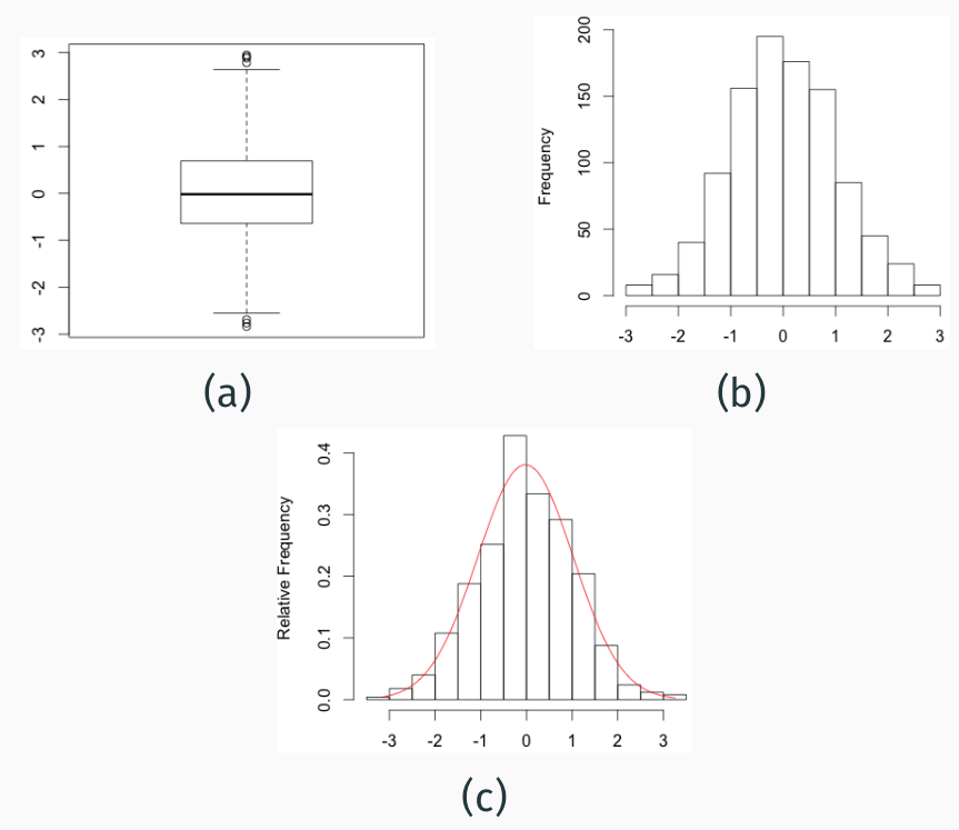
```{R}
a <- rnorm(1000,0)
shapiro.test(a)
``` Shapiro-Wilk normality test
data: a
W = 0.99869, p-value = 0.6797 The observed variation of 1,000 values shows a mean value of \(0\) (Standard deviation = \(1\)) and does not significantly differ from a normal distribution, because \(p>0.05\), which is usually taken as the significance level of rejecting a null hypothesis, \(H_{0}\). In this example, the null hypothesis is that data are normally distributed.
Which of the available possibilities to present the data are best? It depends on the context (i.e. how much space is available), or which aspect of the data is particular interesting. For example, if the data are expected to be normally distributed but the observed data are not, it may be interesting to show the histogram, but not if the observed data do not reject the normality test.
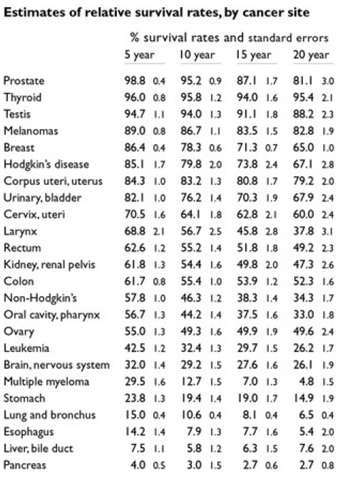
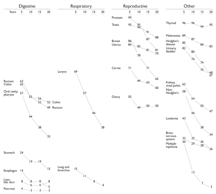
The following example shows how scientific data can be visualized without losing their information content. The data and figures were taken from a review of cancer survival probabilities from the website of Edward Tufte.1. Figure 5 shows the original data from the Lancet article. Figure 6 an improved version of the table by Edward Tufte.
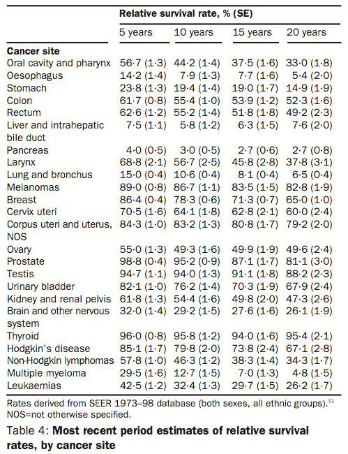
Figure 6 is an improved version of the table by Edward Tufte by changing mainly the type and the size of the font.
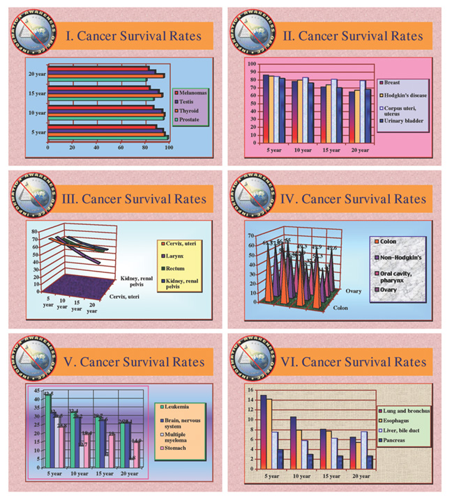
A presentation with Powerpoint is shown Figure 7, where the data have been mixed up to obfuscate them.
There is a third way of making the data on cancer survival rates more accessible: by combining graphical elements with a tabular structure of the original data. The last version in Figure 8 probably results in an optimal structure.
Are data better represented as a picture or a scientific plot?
Possible criteria for decision are:
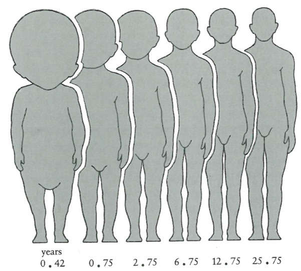
As an example: The relationship of head volume to body volume during different stages of human development (Figure 9).
A more ‘scientific’ approach is to plot the number for the body height and the arm length as shown in Figure 10.
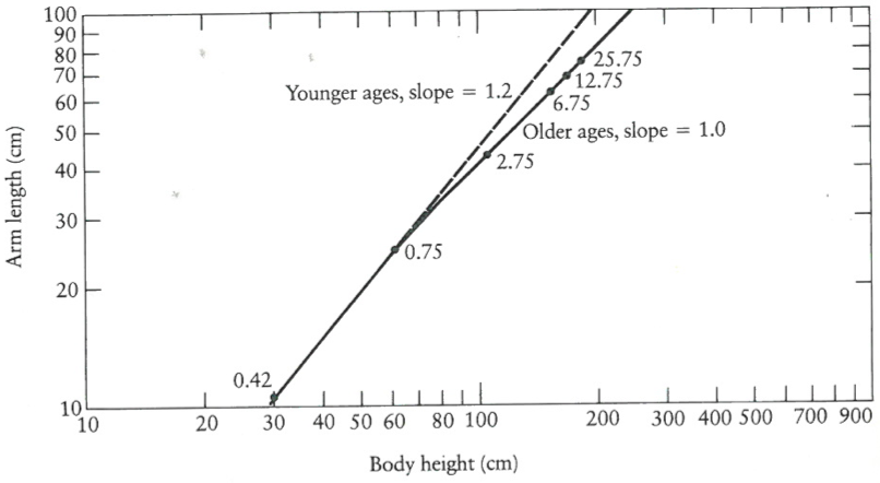
The drawing conveys the key message more efficiently without much explanations required and the plot is more accurate, but requires more a priori knowledge and time to understand.
Sometimes it may be appropriate to present two different types of visualizations. In Figure 11, the expansion of a fireball produced by a nuclear explosion is shown. The series of photographs indicates the growth and the shape of the fireball, but it is difficult to recognize whether the expansion is linear or exponential. Here, the plot provides the clear and unambigous information that the explosion is exponential.
Plots can be annotated to include additional information and to make understanding easier. This is particularly interesting and useful if the general relationship of variables shown in the plot is very strong and unambigous (Figure 12 a). Additional annotations allow to check out details about data points (i.e., to learn about the identity of outliers) or to identify general patterns in the data.
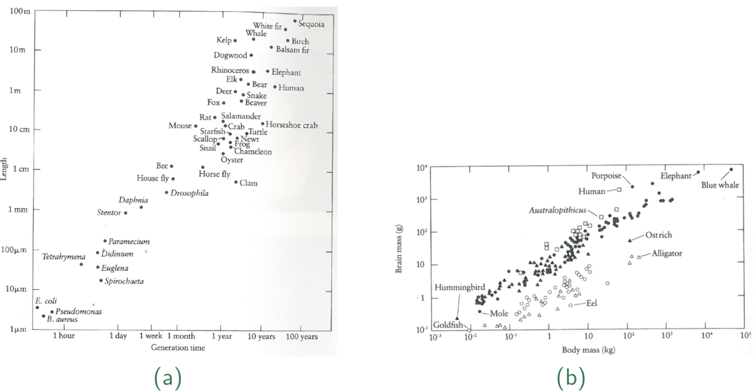
More complex visualizations help to quickly identify ‘hidden’ aspects of the data. For example, Figure 12 b allows quickly to identify the unique position of humans as well as their rapid evolution with respect to the relative brain size.
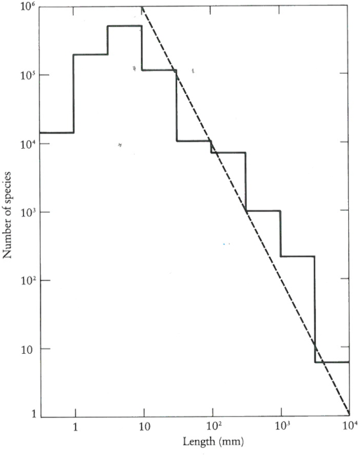
The visualization of data can also be used to easily identify deviations from a hypothesis. For example, it has been hypothesized by ecologists that there exists a relationship between species diversity and the size of the species. They developed a model that models the number of species, \(S\), varies as the inverse square of the linear dimension, \(l\),
\[\begin{equation} \label{eq3} S \propto l^{-2} \end{equation}\]
It has been shown that many groups of animals support this relationship. However, the available data sets deviate from this relationship for small data size. Thus the graphical visualization of the hypothesis and the data immediately point to deviations from the model.
The availability of powerful computers, large amounts of data and new algorithms for data analysis allows new ways of presenting data. One approach is the Worldmapper project which uses publicly available data for creating instructive maps (Figure 14). In this type of map, the size of countries is changed according to the relative value of a data of interest.
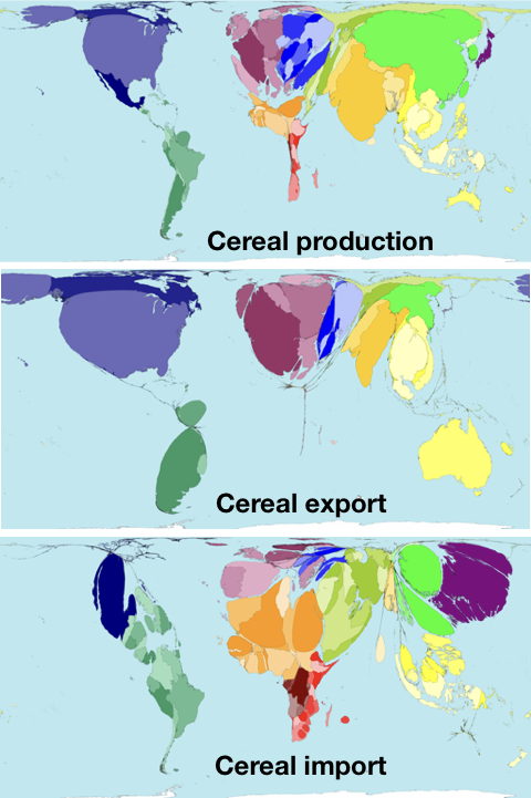
Importantly, this representation works only well by using a reference, i.e., the well known world map. A simple demonstration of how important such a reference is, can be done by turning the map upside down. Then it becomes much more difficult to understand.
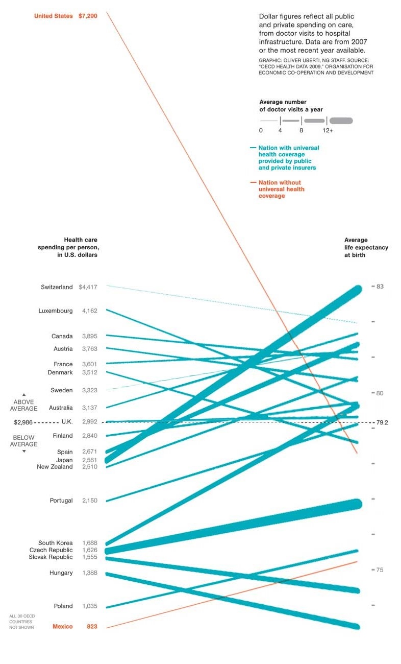
The increasing availability of public data allows comparisons between entities such as countries. By using modern visualization techniques interesting comparisons can be made that are useful for outlining relationships that previously unknown or unexpected such as the lack of a strong relationship between health spending and life expectancy (Figure 15). Furthermore, outliers become immediately obvious.
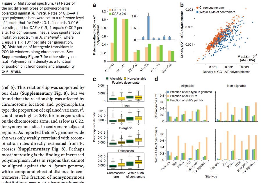
Scientific publishing is generally quite conservative. For this reason, classical approaches to visualization (plots, etc) are frequently used. However, there is a growing awareness for visualization of complex data, particularly in high-profile journals such as Nature and Science, who employ graphical designers to redraw and improve figures that are provided by authors of scientific papers. One consequence is that particularly in journals where the lengths of articles tend to be limited, figures become very - sometimes overly - complex (Figure 16).
As scientific data grow in their complexity, printed representation is not sufficient anymore and the data become web-based. Good examples are so-called genome browsers that allow to zoom through genome sequence data and to retrieve information (Figure 17).
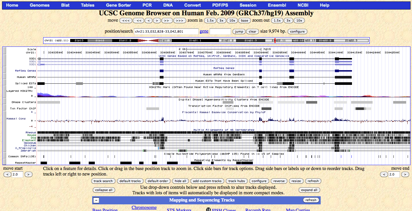
There are limitations which amount of data can be meaningfully implemented into a picture. They are often shown in high-profile publications, but are likely essentially unusable if there is not a parallel, digitally enhanced figure that allows the browsing through the data in an internet browser (Figure 18).
There are also some very good internet resources:
For your master thesis, using the R package to plot the figures is a good start. There are numerous free introductions into R graphics.
Based on the chapter 7 Data Visualization, Calling Bullshit.
Why are concept maps such as the subway map and Venn diagrams susceptible to misuse?
What is the problem of binning data for visualization?
What needs to be considered when plotting data with two different y-axes?
Which arguments play a role when plotting absolute vs. relative values in different types of plots like bar plots, line plots.
Think about the roles of:
Discuss the following points:
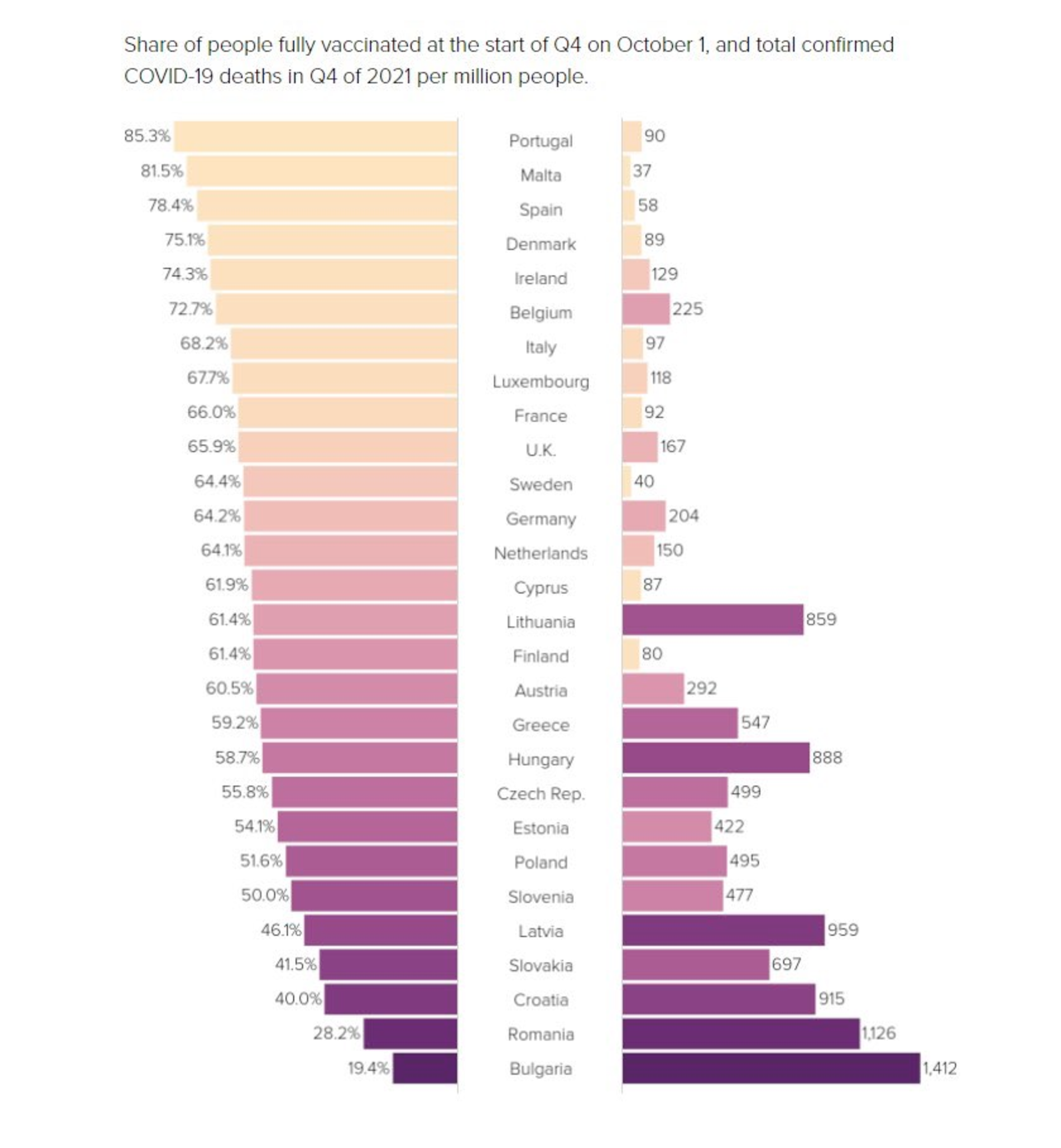
Source: https://twitter.com/Vuckolino/status/1480570696275316739?s=20
How could the plot improved or plotted differentially to identify countries that are outliers in the relationship between vaccination status and corona-related deaths?
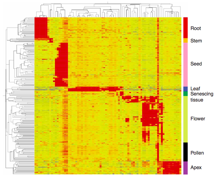
The image shows the distribution of gene families of the banana in other crops.
What are the key messages of this figure?
Source: Low temperature inhibits anthocyanin accumulation in strawberry fruit by activating FvMAPK3-induced phosphorylation of FvMYB10 and degradation of Chalcone Synthase 1 Wenwen Mao, Yu Han, Yating Chen, Mingzhu Sun, Qianqian Feng et al. The Plant Cell, koac006, https://doi.org/10.1093/plcell/koac006 (2022)
Could the message be improved by a different type of graph?